Greetings from Raph

This looks like a very interesting project, and I wanted to stop by and say hello, even though I'm very short on time right now (I'm trying to finish my thesis). I'm sitting on quite a bit of Baskerville material I've accumulated over the years.
First, I have some scans that will probably be of interest. The ATF Baskerville first appeared in the 1923 ATF book, not the 1934 as suggested on the main page. That scan is prominently available at http://levien.com/type/atf_1923/
I also scanned the relevant page of the 1941 book:
http://levien.com/type/atf_1941/...
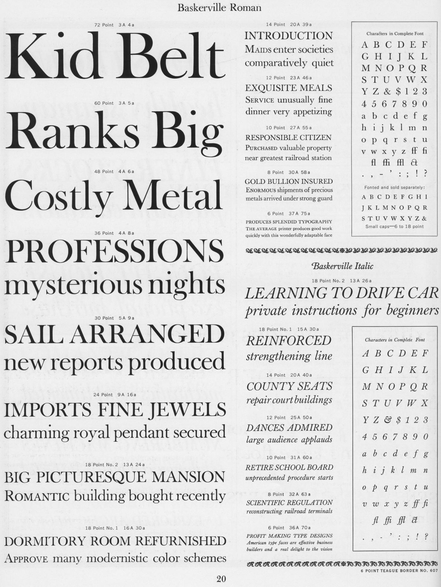
Further, there's a nice sample of the 12pt from the 1923 book:
http://casper.ghostscript.com/~r...

Second, I'd like to warmly encourage people to borrow glyphs that I've drawn. In particular, many of the accessories from Century Catalogue are likely to be compatible, or nearly so, with the design goals of this font. There might be some adjustment necessary for the weight and contrast, and possibly to clean up rounded corners to fit the sharp corners of this font so far, but hopefully they can be helpful. My release of Century Catalogue is under OFL, but if the licensing strategy of this font continues to be dual OFL/GPLv3, I'd be happy to relicense; in practice, I think the difference is nearly negligible. The FontForge files are available at: http://levien.com/type/myfonts/
In addition, I did a very careful tracing of the lowercase of the 18pt ATF italic. A PDF showing is here, and I'd also be happy to share the full FontForge source files and Spiro plate files if desired:
http://levien.com/type/myfonts/p...
Right now, because of lack of time, I'm offering these in "pull" mode, meaning that somebody needs to take my source files and adapt them into the font. I do have git and FontForge, so if the project goes well and I find myself with a little more time, I can imagine cloning my own git repository and so on, but not now. One challenge, of course, is that I strongly prefer to work in Spiro, and FontForge does not currently save those properly in UFO's.
I also have some more scans and other materials I should be able to dig out.
Best of luck on this project, and I have great hopes for a good font to emerge. I'd like to support it however I can, given the constraints on my time right now.
2 replies
-
 Simon Pascal Klein
Awesome.
I’ve updated the page with the new specimens. Are you comfortable continuing to host them—I’m just linking at the moment—or should I host them or bundle them up some other way?
Using your 18pt italic as a base for the italic might be a great option, given the variety of italics that were chosen in adaptions of Fry’s Baskerville. Thank you for making available further glyphs from your Century Catalogue.
Thanks again. (:
-
 Eric S
Hello Raph, thanks for your kind offer which 3 years down the line we gladly take up!
I’ve merged in some of the glyphs from Century Catalogue, they undoubtly need some tweaking but it’s a great start.
https://github.com/klepas/open-baskerville/commit/8ae0cf19aa2039658...
The ATF Italic is quite interesting, what source did you start the tracing from? I can’t find a full 18pt character set for the Italic in the specimens linked above.
It is true that the curves are altogether more rounded, we would have to do some testing to figure out if it would go well together with the Fry’s Baskerville. But I’d be very interested in the FontForge working files (did you embed bitmaps to trace? that would be a great start for the uppercase as well).
You can post a link or send them to eric apestaartje-is-the-dutch-word-for-the-at-sign ericschrijver punt-is-the-dutch-word-for-dot nl
Thanks in advance, enjoy your weekend!
You must be logged in as a project member to reply.