Excessive line-height
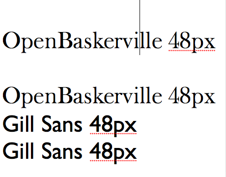
I compiled the UFO to a ttf with Font Forge.
In my font there’s a problem with the line-height,
the lines are way to high in relation to the glyphs, two times as
high as with other fonts.
Can you reproduce this on your setups?
Maybe the x-height is set incorrectly?
-
 Eric S
- Assigned user set to Rob Mientjes
I checked the metrics and they seem o.k. But Fontforge shows the glyphs with all this space above. Rob do you have this if you export from Fontlab?
-
-
Eric S
- Assigned user changed from Rob Mientjes to Dave Crossland
- Tag set to afdko, compiling, fontforge, line-height, workflow
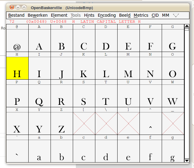
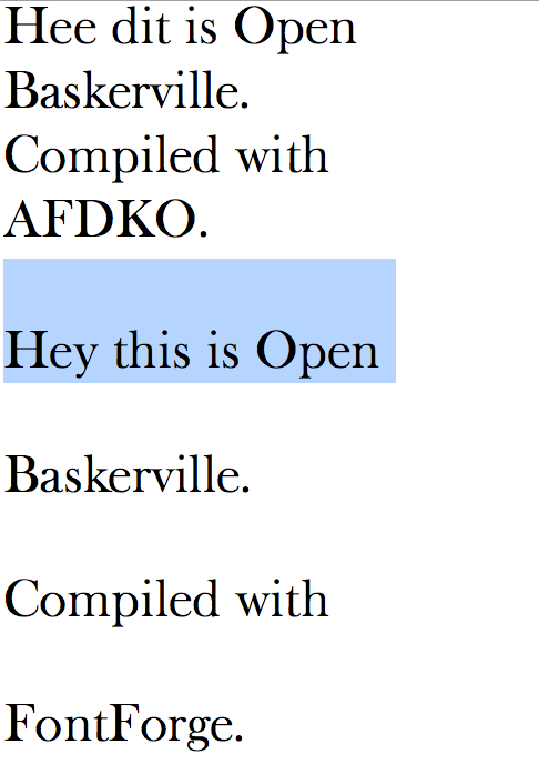
Ah. It’s a FontForge problem.
Compiling the same font through the Adobe Font Development Kit doesn’t yield this problem.
(see attached comparison)
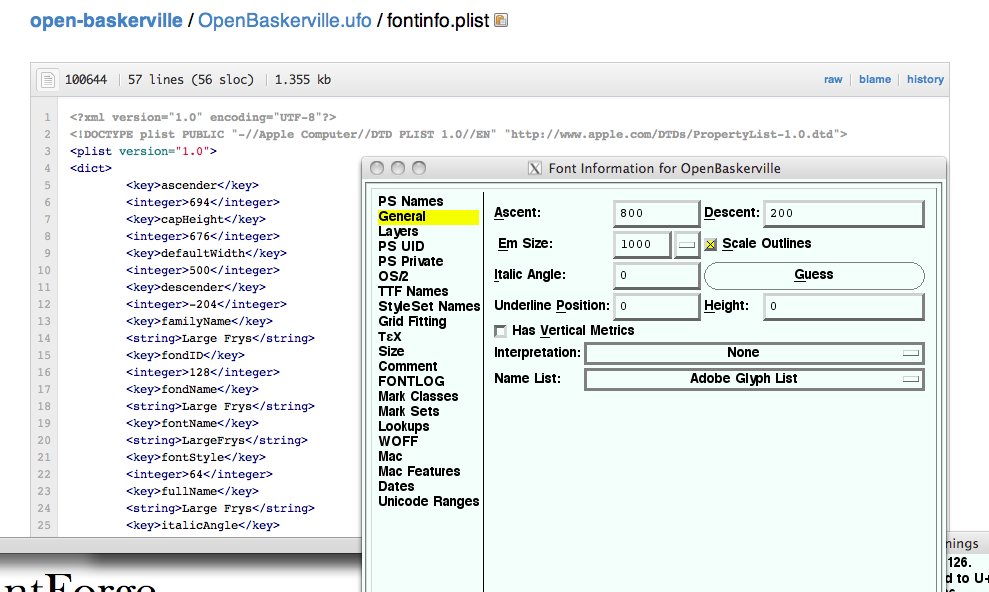
On closer inspection, FontForge doesn’t seem to take into account the ascent and descent as specified in the fontinfo.plist, but rather use its standard settings.
(see other screenshot)
I’m reallocating this to Dave :) Dave do you think I am correct in my assesment? Is this what’s causing the problem? In that case we’d have to file a bug at FontForge, no?
-
 comparison_afdko_fontforge.png
49.8 KB
comparison_afdko_fontforge.png
49.8 KB
-
 fontforgefontmetricsfromufo.png
133 KB
fontforgefontmetricsfromufo.png
133 KB
-
Eric S
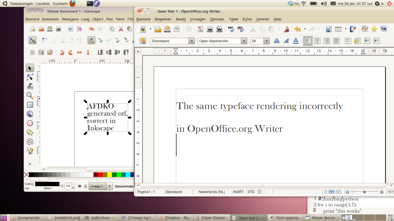
Well, actually it’s not exactly a FontForge problem—when reading in the AFDKO generated font FontForge also shows excess line-height, and this also happens in at least one other Linux program: OpenOffice.org Writer.
Inkscape and gEdit work OK, as do OS X applications.
So there must be some element in the UFO that causes inconstencies for certain programs…
Here’s the UFO and the generated OTF’s:
https://github.com/klepas/open-baskerville/tree/compile-test-caseNow I need advice from font wizards :)
-
Eric S
- Assigned user cleared.
OK,
So I jumped on the FontForge mailing list for help.
Khaled Hosney pointed out that some of the characters had accents way above their normal positions. Probably, the result of an accent builder script gone wrong. So the line-height is not excessive, it’s the application rendering the font based on the height of the highest glyphs.
http://sourceforge.net/mailarchive/forum.php?thread_name=6D03471D-A...
Programmatically check:
from robofab.world import RFont
f = RFont('OpenBaskerville.ufo')

for glyph in f:
    if glyph.box[3] > 1000:
        print glyph.name, glyph.box
gives
scaron.001 (47, -14, 327, 1811)
scaron.002 (47, -14, 327, 1811)
Scaron.001 (45, -14, 480.00217601496456, 2040)
Scaron.002 (45, -14, 480.00217601496456, 2040)
zcaron.002 (30, 0, 436, 1811)
zcaron.001 (30, 0, 436, 1811)
Zcaron.002 (45, 0, 654, 2040)
Zcaron.001 (45, 0, 654, 2040)
Could safely remove these, as they are all alternate glyphs—their suffixless counterparts have their carons in the right location. With the glyphs removed the problem is gone, we can now build from FontForge.
CLOSED,
https://github.com/klepas/open-baskerville/commit/4c1270915d8b78e72... -
Eric S
- State changed from new to resolved
Please Sign in or create a free account to add a new ticket.
With your very own profile, you can contribute to projects, track your activity, watch tickets, receive and update tickets through your email and much more.